Lola Blankets: User Focused Redesign
Overview of Project
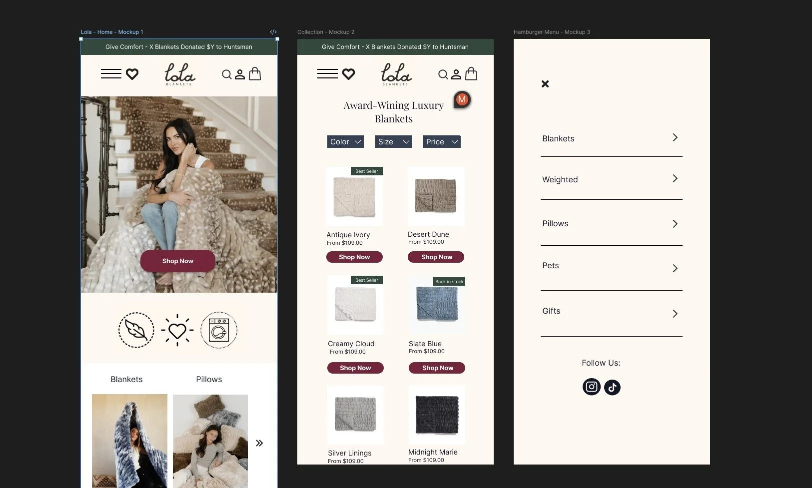
This redesign project focused on reimagining the Lola Blankets e-commerce experience with a modern, mobile-first approach. The goal was to create a clean, cozy, and luxurious interface that reflects the brand’s identity while addressing usability issues. I redesigned core flows including the homepage, product pages, blanket size guide, shopping cart, and introduced a “Find Your Lola” quiz to guide customers toward the perfect product.
Background
Lola Blankets is a direct-to-consumer brand specializing in luxury faux-fur blankets and home comfort products. The original website conveyed warmth but lacked clear user flows, modern interaction patterns, and accessibility considerations. With the majority of traffic coming from mobile devices, the design needed to prioritize clarity, scannability, and conversion optimization on small screens.
Problem
The original site did not effectively guide customers to the right blanket size or style.
Key information (care instructions, sizing, product details) was buried or inconsistent.
Navigation was cluttered and lacked clear categories for secondary products (pillows, gifts, pets).
The mobile experience was not optimized, leading to higher bounce rates and lower conversions.
There was limited storytelling to differentiate Lola from competitors in the luxury blanket market.
Solution
Mobile-first layouts: Redesigned homepage, product listings, and navigation with simplified, touch-friendly interactions.
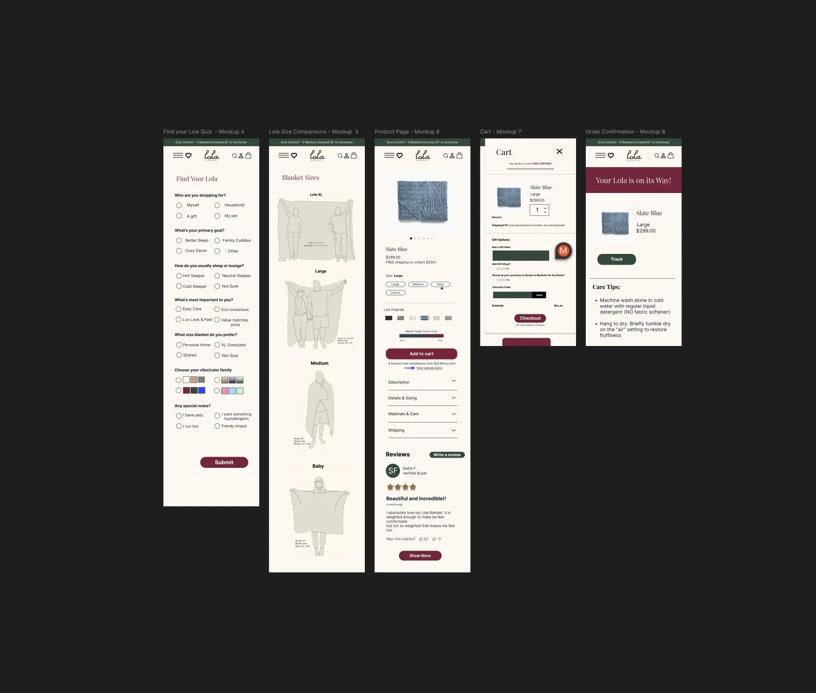
Guided shopping: Created a “Find Your Lola” quiz to personalize recommendations based on customer needs (sleep style, aesthetic preference, use case).
Visual blanket size guide: Illustrated blanket sizes with models of different heights for clear scale reference, ensuring customers choose confidently.
Streamlined navigation: Introduced a clean hamburger menu with clear categories (Blankets, Weighted, Pillows, Pets, Gifts).
Product storytelling: Added visual consistency with lifestyle photography, highlighted customer reviews, and structured details to inspire trust and confidence.
Purchase confidence: Designed clear cart and order confirmation flows with shipping, care tips, and tracking integration.
Impact of Redesign
Improved mobile usability with simplified layouts and optimized navigation.
Reduced choice overload through the quiz and clear product categorization.
Increased purchase confidence by surfacing sizing visuals and care instructions upfront.
Elevated brand identity with consistent typography, imagery, and color palette aligned to Lola’s luxurious but approachable positioning.
Supported conversion growth by making “Shop Now” CTAs prominent and tying storytelling directly to product benefits.
Supported brand loyalty and long-term conversion rates via the “Find your Lola” Quiz. Conversion rate uplift: +15-25%. Return reduction: -20-30% fewer returns because customers are more confident in selecting the right size/style. Email capture: opt-in rate of ~40-50% through quizzes vs 3-5% from standard popups.
Metrics in action: If site conversion was set at 2%, quiz users could convert at 2.5-3%. With 35K monthly visits, that’s +200-300 extra orders per month.
Learnings
Designing for mobile-first forces clarity: every piece of text and UI element must earn its place.
Customers respond strongly to visual education tools (like size guides), which reduce hesitation.
Simple quiz interactions can double as both personalization and lead-generation tools.
Balancing luxury branding with usability requires consistent typography, warm tones, and minimalist layout to avoid clutter.
Iterating on user flows (cart, checkout, order confirmation) showed me how important trust signals are to e-commerce success.